Tips for Choosing Calm Colors to Create a Relaxing Home
Creating a calm and soothing atmosphere in your home can significantly enhance your daily comfort and wellbeing. One of the easiest and most effective ways to achieve this is through the colors you choose for your walls, furniture, and décor. Calm colors promote relaxation, reduce stress, and create a welcoming space where you can unwind after a busy day.
In this post, we’ll share practical tips for selecting calm colors for your home, so you can create a serene environment tailored to your taste.
Why Choose Calm Colors?
Before diving into the tips, it’s helpful to understand why calm colors matter. Colors have a psychological impact on mood and emotions. Soft, muted shades tend to evoke feelings of tranquility, making them ideal for bedrooms, living rooms, and other spaces meant for rest and reflection.
Bright or highly saturated colors, while energizing, can sometimes feel overwhelming if overused. Calm colors strike a balance by providing visual comfort and creating a peaceful ambiance.
Popular Calm Colors and Their Effects
Here are some commonly preferred calm colors along with their typical effects:
– Soft Blues: Often associated with the sky and water, blue tones promote peace and relaxation.
– Muted Greens: Remind us of nature and growth, bringing freshness and balance indoors.
– Warm Neutrals: Shades like beige, taupe, and soft greys create a cozy, inviting environment.
– Pastel Purples: Light lavender and lilac hues are gentle and soothing without being cold.
– Natural Whites: Off-whites or creamy tones add brightness while maintaining softness.
Tips for Choosing Calm Colors for Your Home
1. Consider the Room’s Purpose
Start by thinking about how you use each room. A bedroom might benefit most from cool, calming blues or soft greens to encourage restful sleep, while a living room can be warmed up with neutral or earthy tones to foster comfort and conversation.
2. Test Samples Before Committing
Colors can look very different under natural versus artificial light. Before painting an entire wall, test samples on small sections and observe them throughout the day. This helps ensure the color remains calm and appealing in your space.
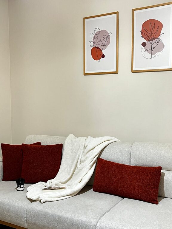
3. Use the 60-30-10 Rule
This classic interior design rule helps balance colors effectively:
– 60% dominant color (walls or large surfaces)
– 30% secondary color (furniture, curtains)
– 10% accent color (pillows, décor)
For calm rooms, keep these colors soft and cohesive to avoid visual clutter.
4. Embrace Monochromatic Schemes
Using different shades and tints of one color can create a harmonious, calming effect. For example, pairing pale green walls with deeper green accents and soft white trim keeps the palette unified and relaxing.
5. Incorporate Natural Elements
Colors inspired by nature—like soft browns, leafy greens, and sky blues—tend to calm the mind. Pair these hues with natural materials such as wood, stone, or linen to enhance the tranquil feel.
6. Avoid Overly Bright or Highly Saturated Colors
Bold reds, neon yellows, or intense oranges can be stimulating rather than calming. If you love vibrant colors, consider using them sparingly as accents rather than dominant tones.
7. Think About Undertones
Colors can have warm or cool undertones, which affect the mood they create:
– Warm undertones (yellow, red) add coziness.
– Cool undertones (blue, green) feel more refreshing.
Choose undertones that suit your space and personal preference.
8. Keep the Ceiling and Trim Light
To maintain a calm and airy feeling, keep ceilings and trims in light, neutral shades. This helps open up the room and complements the main wall colors without overpowering them.
9. Use Soft Lighting to Enhance Colors
Lighting greatly influences how colors appear. Use soft white bulbs or lampshades that diffuse light gently to accentuate calm colors, creating a warm and soothing ambiance.
10. Balance Color with Texture and Patterns
Introduce subtle textures and minimal patterns in fabrics or décor to add interest without disturbing the calmness. Smooth surfaces and soft textiles like cotton or velvet blend well with muted colors.
Conclusion
Choosing calm colors for your home is a rewarding way to enhance your living environment. By considering the purpose of each room, testing colors under different lighting, and balancing hues thoughtfully, you can create spaces that invite relaxation and peace.
Remember, the best calm colors are those that make you feel comfortable and happy. Don’t be afraid to experiment with different shades and combinations until you find the perfect palette that suits your style.
With these tips in mind, you’re well on your way to designing a tranquil sanctuary you’ll love coming home to. Happy decorating!